69 Love Songs
“I don’t believe in the sun. How could it shine down on everyone, and never shine on me?” I Don’t Believe in the Sun, The Magnetic Fields
There had been a distinct lack of shine in my life, but that has now changed. In case you don’t get my tenuous reference (be prepared for more of them), I’m talking about Shiny - the R package to create interactive web apps. I have now deployed my first Shiny App: A lyrical analysis of ‘69 Love Songs’ by the Magnetic Fields.
In this blog post I’ll detail some of the things I learnt and some of the challenges I faced along the way. I won’t go into any great technical detail on the app (there’ll be no code here), but I’ll aim to document my process as best I can, and if you do want to see the code it is available in an RStudio Cloud Project here.
RStudio Shiny Contest: The Motivation
I have known about Shiny for some time but only started to learn it towards the end of last year. I have dabbled in some Proof of Concept apps at work, but hadn’t reached a completed app I was happy with. All I needed was a little push, and that came from the announcement of a Shiny Competition. It wasn’t until 2 weeks ago (20th February) that I decided I was going to do it, and use it as an opportunity to resurrect some analysis I had started several months earlier. 2 weeks later and it is complete and submitted into the competition.
The Subject
69 Love Songs is a three-volume concept album (of sorts) by the American indie-pop band Magnetic Fields. No prizes for guessing that it contains 69 love songs, but each track provides its own twist on a traditional love song, and is imbued with the dark humour of chief songwriter Stephin Merritt. They say it’s good to have domain knowledge when working with data, and in this case I certainly do! 69 Love Songs has been a constant companion to me for over 10 years, and I could probably recite the lyrics to every track.
Tidy Text
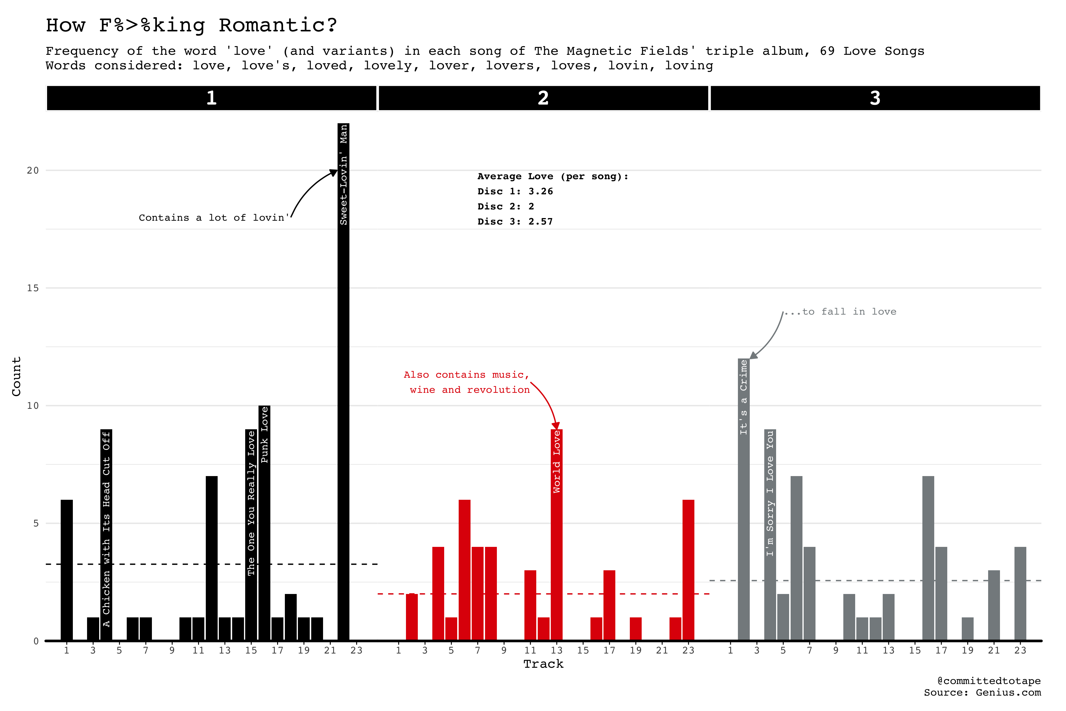
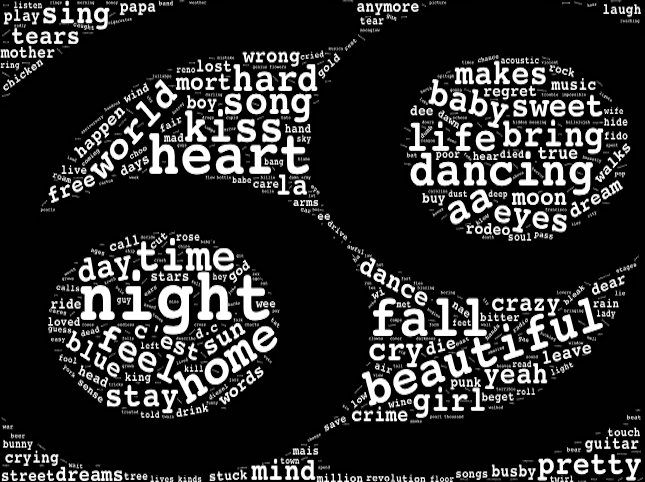
But what does Stephin sing about? I’d had the ‘Text Mining with R’ book by Julia Silge and David Robinson sitting on my shelf for several months, but had only dipped into it briefly. I always knew my first foray would be to use it to analyse song lyrics though. I scraped the lyrics for ‘69 Love Songs’ from genius.com back in October, and had started to use the tidytext package on the data, but had put it to one side as other projects took over. This gave me a great starting point to develop my app though, as all the data and a few graphs were already there. Specifically, the 2 graphs below:
I wanted to extend my knowledge of the tidytext package beyond basic word counts and word clouds though, and I wanted my app to have more than 2 graphs! Therefore, I had the perfect reason to delve a little deeper into text mining, and the wonderful book. I ventured into sentiment analysis (which I had touched on before) and bigrams (which was new to me) to help complete the app. These are more strings to my text-mining bow, but I still have some way to go in the world of text-mining. Sentiment analysis is a highly nuanced, slippery beast, and I’m not sure the songs I’ve identified (using the bing lexicon) as being the most positive and negative on the album are the ones I would’ve expected from my own experience. Without the submission deadline I would’ve investigated this further.
Network Return
In visualising the bigrams I had the opportunity to revisit network visualisation which I had first played around with in my Wes Anderson Actor Network. I initially had intended on using the same combination of tidygraph and ggraph but ended up yearning for some further interactivity to bring the app more to life. This led me to stumble upon the visNetwork package. As it turns out, this plays beautifully with the tidygraph package. I could set the aesthetics for the nodes and edges of the network, much like I did in my Wes Anderson network, and then pass this augmented dataframe to the visIgraph function of visNetwork. In a few hours of discovering this package I had an interactive network visualisation that I was happy with, although I will certainly be returning to this package for some more network fun later.
WordCloud Troubles
Much like when it comes to love, things don’t always go to plan, and in the end the wordcloud shown earlier (in the shape of the album front cover) had to be shelved. This was created by using an image (png file) as a mask via the figPath argument in the wordcloud2 function/package. However, I couldn’t get it to render in my Shiny app, and I think it relates to this issue on GitHub. I therefore opted for the basic wordcloud shape, which slightly dented my aesthetic aspirations, but I still like it and wordcloud2 is great!
Aesthetics and CSS
I had a clear view from the start that I wanted the app to follow the aesthetics of the album artwork. I’ve used the Courier font throughout, and coloured the app with the white, black, red and grey seen on the front cover. I employed a CSS file to change certain elements throughout the app. CSS and HTML are still very new to me, but I’ve been picking things up to meet the needs of this blog, and now for Shiny app development. Most changes were fairly straightforward, but as I came to discover, changing the appearance of checkboxes is a real pain! After spending far too long going through posts on Stack Overflow I came to something satisfactory, but my advice is: change checkbox styling at your peril! You can check out the styles.css in the RStudio Cloud project to see what I did.
The App
I’ll now give a brief rundown of each page on the app. I decided to use the navbarPage layout in the UI so I could format each page how I wanted (i.e. so each page isn’t tied to the same sidebar panel inputs). This gave me the flexibility to layout each page how I wanted:
Intro
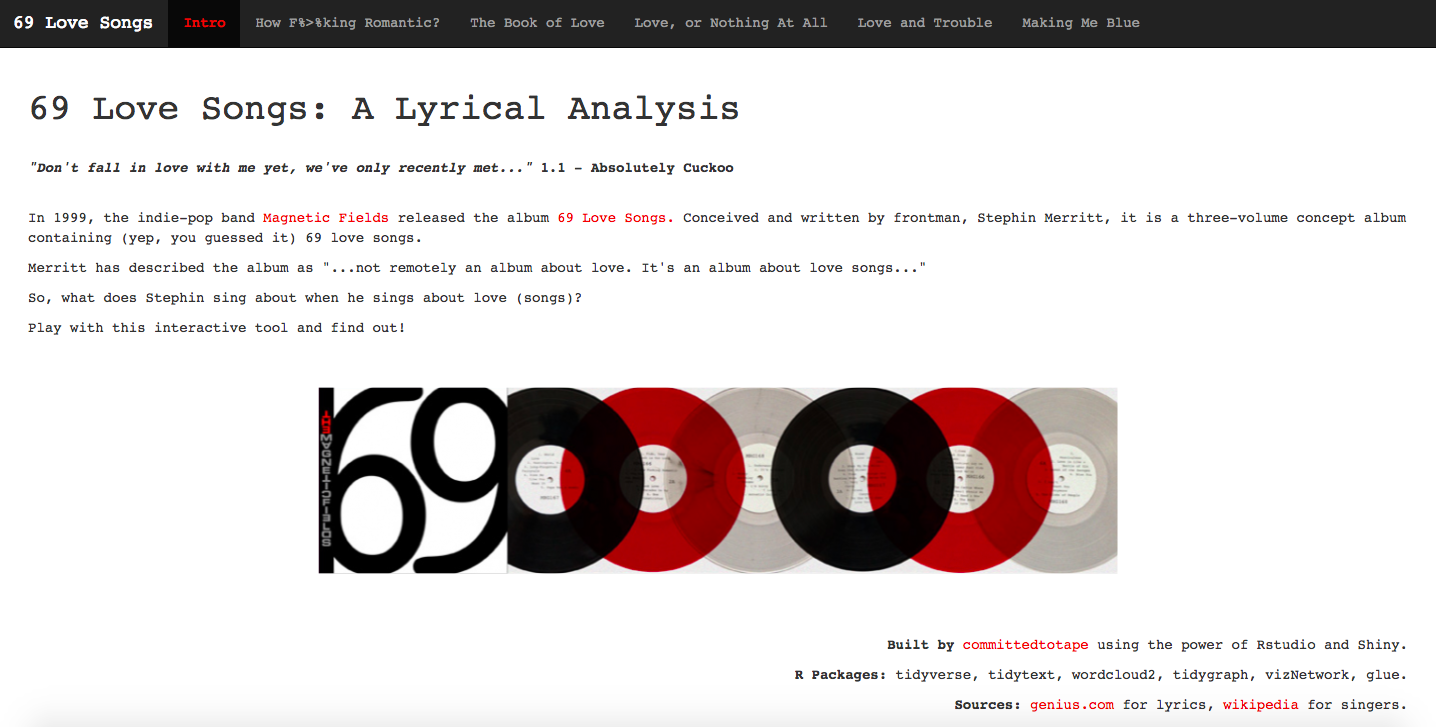
Setting the scene for the app. I decided to include a pertinent (or perhaps tenuous) lyric from the album on each page. Essentially, I wanted to geek out as much as possible.
How F%>%king Romantic
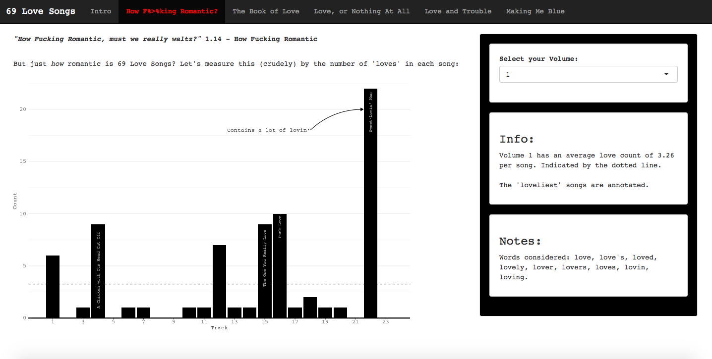
Based on the initial graph displayed earlier, the bars represent the number of occurences of the word ‘love’ (and variants, e.g. loves, lover) in each song. I’ve removed the facets and allowed the user to pick which volume to look at. The ‘Info’ box then updates along with the graph.
The Book of Love
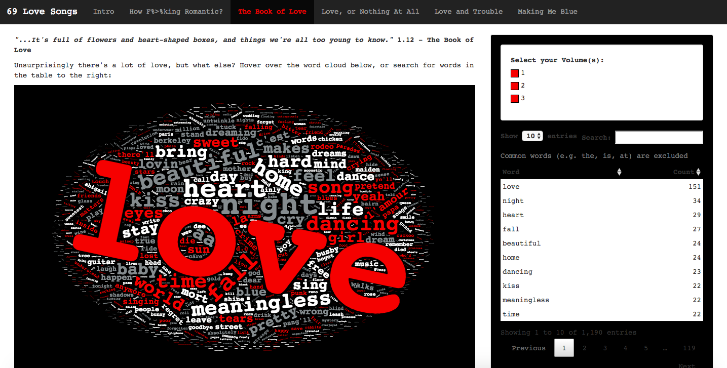
Again, based on a previously created graph, but as explained earlier, I couldn’t recreate the wordcloud that mirrors the album artwork. If you don’t want to scan the wordcloud for a particular word, you can search the table on the right, built with datatable from the DT package.
Love, or Nothing At All
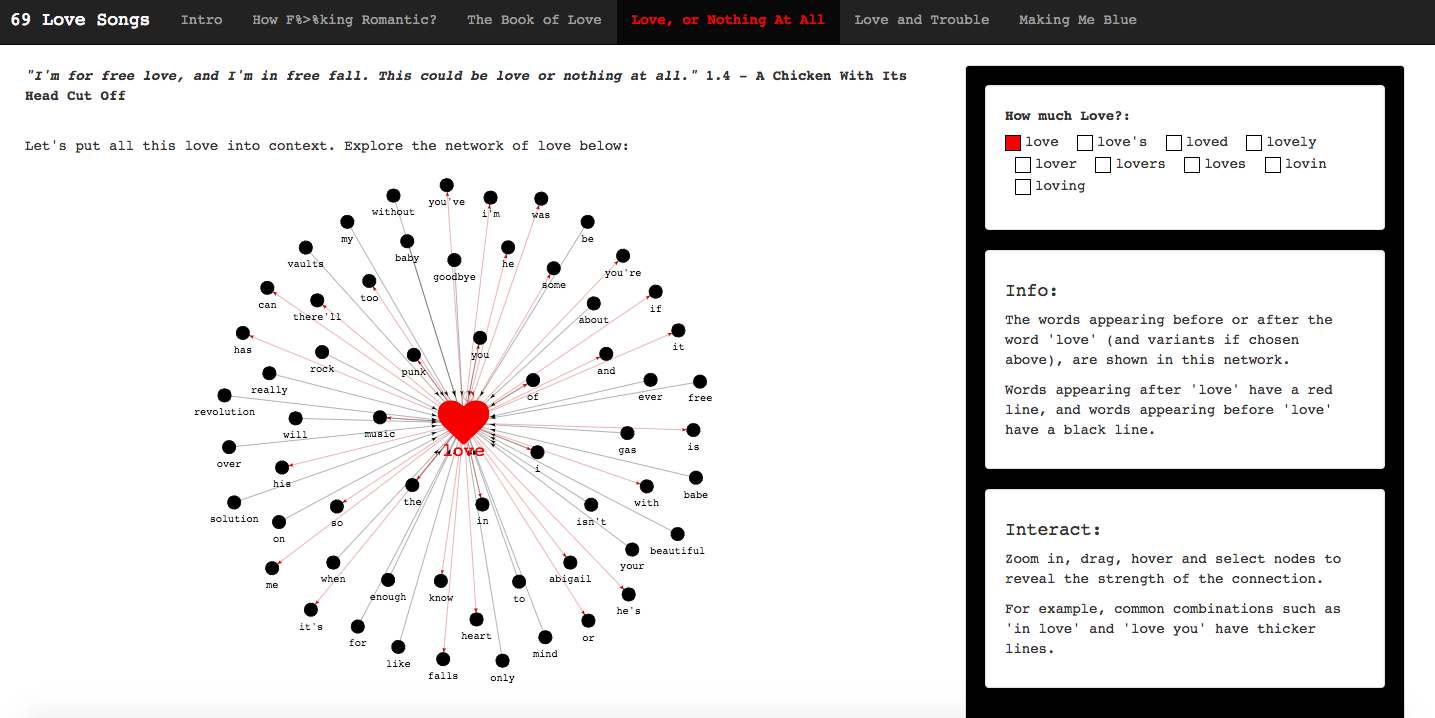
Built with the aforementioned visNetwork package. A network of bigrams involving the word ‘love’. You can include/exclude the ‘love’ variants to increase/decrease the network if you wish.
Love and Trouble
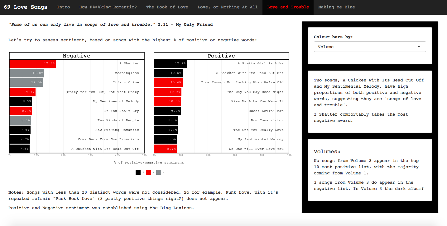
Based on the sentiment analysis to calculate the proportion of positive and negative words in each song. You can choose to colour the bars by either the Volume the song appears on, or the lead vocalist on the song. The bottom commentary box on the right then updates accordingly.
Making Me Blue
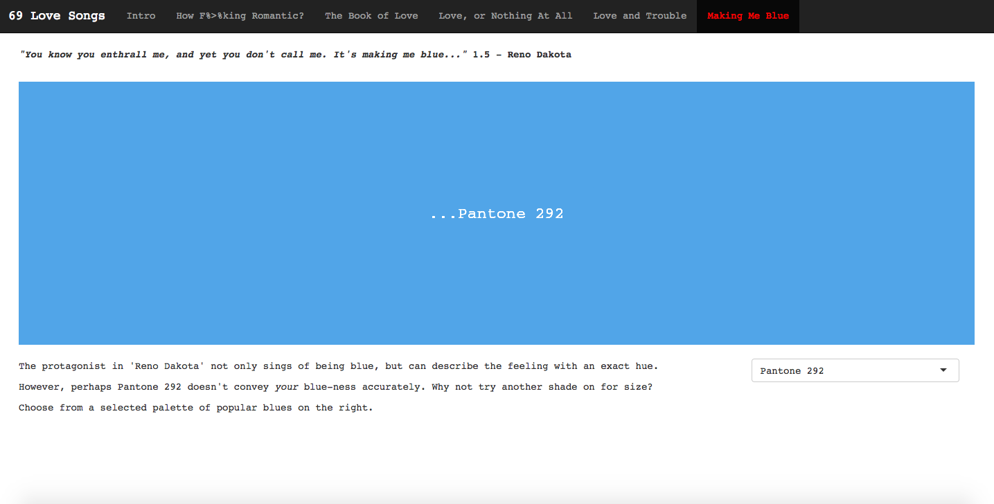
Some fun to finish off with, just to amuse myself if nothing else.
Mobile Unfriendly
On deploying the app I discovered that not all elements of the app are rendered nicely on mobile. I optimised the app for how it looked on my laptop as I developed it. The wordcloud and network plots come fully responsive out of the box, so they work well on mobile, but the pages with ggplot2 plots get a bit mangled. This has certainly taught me to consider the UX on different devices when developing an app, and my next Shiny endeavour will take this into account. I know that there are options for making plots responsive (I’ve seen plotly used), but I didn’t have time to rectify this. Any suggestions are welcome!
The Submission
In submitting my app to the contest, I had to do 3 things:
- Sign up and deploy my app at shinyapps.io.
- Make all the code available in a RStudio Cloud project.
- Sign up to the Rstudio Community to post my submission.
3 fantatstic things in the R universe that I had never previously used! So not only have I improved my Shiny skills, text mining skills and network viz skills by participating in the competition, I am also now even more connected to the R communtiy than I was before. So regardless of whether I win a prize or not, this exercise already feels like a success to me. And I will certainly be deploying more shiny apps, and using the RStudio Community, to develop my skills further. But for now, I have this app, and here are the links one more time for those at the back:
Looking through the other submissions I am yet again blown away by all the amazing things being done by people through the power of R. There are so many cool applications far more edifying and important than what I’ve produced. But if you’re looking for an app focussing on a seminal indie album from the turn of the century, I’ve got you covered.
Update 10th April 2019 - I Won!
I still can’t believe it, but the winners of the Shiny Contest have been announced, and I have been awarded ‘Best Design’! Read more about my thoughts on this on my new blog post.