Daniel Johnston
“True love will find you in the end / You’ll find out just who was your friend / Don’t be sad I know you will / But don’t give up until / True love will find you in the end.” Daniel Johnston, True Love Will Find You In The End
On the evening of the 11th September this year (2019) I learned of the passing of American singer-songwriter and artist Daniel Johnston. I have been a huge fan of Daniel Johnston’s work, ever since seeing the documentary The Devil and Daniel Johnston. The evening after his passing I decided to sit down and pay tribute to the great man. I put my headphones on, listened to his songs, and fashioned the following data visualisation.
This blog post will now run through what I did. Stay tuned for a quick tour of the rvest package for scraping web data, some data tidying with tidyverse packages and a customised and annotated plot using ggplot2, glue and ggtext packages. I’ll also talk through my design choices for the final graph, and how to spice-up a boring bar chart.
What to visualise?
“I see your face / I picture myself with a guitar” I Picture Myself with a Guitar
To pay tribute to one of my songwriting heroes, I needed to think of something to visualise and then get hold of the data. Daniel Johnston’s recordings have a rawness and authenticity to them, perhaps best described as ‘lo-fi’, which the casual listener may find off-putting (not me, I love it!). But listen hard enough and you will hear some of the finest pop songs ever written. Many of the biggest names in American alternative rock, such as Wilco, Flaming Lips and Tom Waits, have taken his songs and lovingly covered them, making them more accessible to a wider audience. Visualising his most covered songs seemed like a fitting way to highlight just how influential he has been in the world of alternative music.
Getting the data
“I’m getting closer to the facts / I’ve turned my back on silly dreams” The Sun Shines Down On Me
As luck would have it, a quick google of “Daniel Johnston covers” brought me to the fan site Rejected Unknown which holds a list of Daniel’s songs performed by other artists. How exhaustive and accurate this list is, I couldn’t say. But I quick scroll through the list I can see the key recordings I know of, such as those on the fantastic covers albums I Killed the Monster and Discovered, Covered.
Now we need to scrape the data, which I’ll do using the rvest package by Hadley Wickham, after loading the packages I’ll be using throughout:
library(rvest) # web scraping
library(tidyverse) # all the things
library(glue) # clever pasting
library(extrafont) # fonts
library(ggtext) # adding image to plot
I’ve covered web-scraping with the rvest package before in a previous blog post. To identify what part of the page to scrape, I highly recommend selectorgadget.com as Hadley does in this short tutorial. I have it as a Chrome extension, and you can simply click on areas of the website to highlight the data you want. In this case, I am using an xpath selector rather than a css selector as this was the only way I could select the data as a table, which makes the subsequent wrangling of the data much easier. I am a real novice when it comes to web development languages, so I find scraping data from the web tends to involve a lot of trial and error!
covers_page <- read_html("http://www.rejectedunknown.com/covers/")

covers_table_scrape <- covers_page %>%
  html_nodes(xpath = '//*[(@id = "AutoNumber5")]//table') %>%
  html_table() %>%
.[[1]]covers_table_scrape## # A tibble: 544 x 2
## X1 X2
## <chr> <chr>
## 1 A Little Story Dr Bluepen
## 2 <NA> Olive Daphne
## 3 <NA> Richard there (Apskaft Tribute To…
## 4 Ain't no woman gonna make a George… The Arizona Quints
## 5 Almost Got Hit By A Truck Duncan Miller
## 6 <NA> "The Messengers (Portland,\n …
## 7 <NA> "Jon Gretzinger aka \"The Mr Kingdo…
## 8 An Angel Cry Weird Paul Petroskey
## 9 An Idiot's End Dr Bluepen
## 10 And You Love It Fusibles
## # … with 534 more rowsTidying the data
“…since that day it’s been a struggle trying to make sense out of scrambled eggs” Peek A Boo
This gives me the data, but now to make sense of it. There are a few things to tidy up before going any further. I’ll give the variables meaningful names. Also, the song names are not filled in for each row, only the first row for each song is populated. Thankfully, there is a tidyr function which helps solve this exact problem: fill. Once again, the tidyvese makes data wrangling surprisingly painless!
covers_tidy <- covers_table_scrape %>%
  rename(song = X1, performer = X2) %>%
  fill(song) %>%
  filter(performer != "")

covers_tidy
## # A tibble: 542 x 2
## song performer
## <chr> <chr>
## 1 A Little Story Dr Bluepen
## 2 A Little Story Olive Daphne
## 3 A Little Story Richard there (Apskaft Tribute To …
## 4 Ain't no woman gonna make a Georg… The Arizona Quints
## 5 Almost Got Hit By A Truck Duncan Miller
## 6 Almost Got Hit By A Truck "The Messengers (Portland,\n …
## 7 Almost Got Hit By A Truck "Jon Gretzinger aka \"The Mr Kingdom…
## 8 An Angel Cry Weird Paul Petroskey
## 9 An Idiot's End Dr Bluepen
## 10 And You Love It Fusibles
## # … with 532 more rowsThe performer names look a bit messy, but I’m going to leave them as they are as I’m most interested in the song names, and which songs have been covered the most. Having explored the data, I’ve decided that songs covered 9 or more times is a good cut-off point for displaying in a plot.
most_covered <- covers_tidy %>%
  count(song, sort = TRUE) %>%
  filter(n >= 9) %>%
  mutate(position = row_number(),
         label_times = if_else(position == 1, glue("Covered
                                                   {n}
                                                   times"),
                               glue("{n}")))
I have also created a variable called label_times to be used in the plot for labelling how many times each song has been covered. glue, by Jim Hester, is my new favourite method for pasting strings together. The glue function is similar to the base paste function, but in my opinion is easier to write. The code in the curly brackets is evaluated, so in this case the variable n, the number of times the song was covered, is inserted in a string. It also allows you to add line breaks just by placing on a new line in your code (no need to use \n!)
most_covered## # A tibble: 11 x 4
## song n position label_times
## <chr> <int> <int> <glue>
## 1 True Love will find you in the End 74 1 "Covered\n74\ntim…
## 2 Walking the Cow 38 2 38
## 3 Devil Town 20 3 20
## 4 Hey Joe 12 4 12
## 5 Casper the Friendly Ghost 11 5 11
## 6 Silly Love 11 6 11
## 7 Some Things Last a Long Time 11 7 11
## 8 Speeding Motorcycle 10 8 10
## 9 Don't Let the Sun Go Down on Your Gri… 9 9 9
## 10 Honey I sure miss you 9 10 9
## 11 Life In Vain 9 11 9Before the plotting code, there are a few more dataframes created to help with annotating the final plot.
artists_pick <- most_covered %>%
  filter(position <= 3) %>%
  add_column(artists = c("Cover artists include: Wilco, Beck and Spiritualized",
                         "Pearl Jam, TV on the Radio",
                         "Bright Eyes"))

overall <- covers_tidy %>%
  summarise(songs = n_distinct(song), covers = n())
Bar charts are boring
“I cannot help but be restless / When everything seems so tasteless / And all the colors seem to have faded away” Living Life
Now to plot what I have. But I want to make something inspired by Daniel Johnston’s work. Along with being a songwriter, he was also an artist, with his artwork featured on the majority of his records, and also exhibited in galleries around the world. Perhaps his most iconic piece of art is the frog (known as Jeremiah the Innocent) on his album ‘Hi, How Are You’:
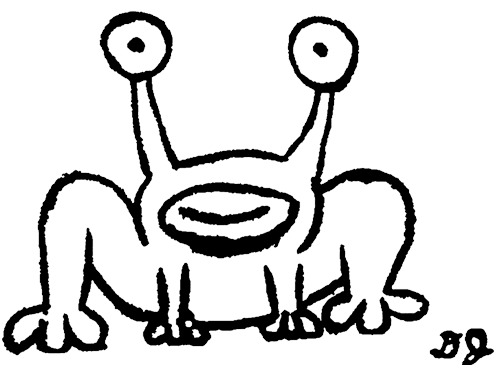
If you’ve never heard of Daniel Johnston, you may still recognise this image, especially if you live in Austin, Texas, or are a Kurt Cobain fan.
Inspiration also came from this blog post by Andy Kirk on how a boring bar chart can be styled into something a bit more engaging. Bar charts are ubiquitous for a reason, as they provide an easily perceived comparison across different categories. However, they can also end up looking pretty dull and uninspiring! I particularly liked the aesthetics of the 4th example in Andy’s post, so I took this as a starting point for my viz too.
Now to combine these thoughts into a worthy visualisation!
Step-by-step plot
“Listen up and I’ll tell a story / About an artist growing old” Story of an Artist
Let’s start with a fairly basic plot, but instead of a bar plot (using geom_col), let’s create the eye tentacles of the frog using geom_linerange! I’ll set the font within the theme_void function which will also provide a blank slate for the theme of the plot:
p <- ggplot(most_covered, aes(x = position, y = n)) +
  scale_x_reverse() +
  geom_linerange(aes(x = position + 0.1, ymin = 0, ymax = n),
               size = 1.5) +
  geom_linerange(aes(x = position - 0.1, ymin = 0, ymax = n),
                 size = 1.5) +
  coord_flip() +
  labs(title = "...you'll find out just who was your friend",
       subtitle = "Daniel Johnston's Most Covered Songs",
       caption = glue("Source: rejectedunknown.com
                      Graphic: @committedtotape")) +
  theme_void(base_family = "Gaegu") +
  theme(
        plot.title = element_text(hjust = 0.1, size = 24, face = "bold"),
        plot.subtitle = element_text(hjust = 0.06, size = 16),
        plot.caption = element_text(size = 12),
        plot.margin = margin(10,10,10,5))

p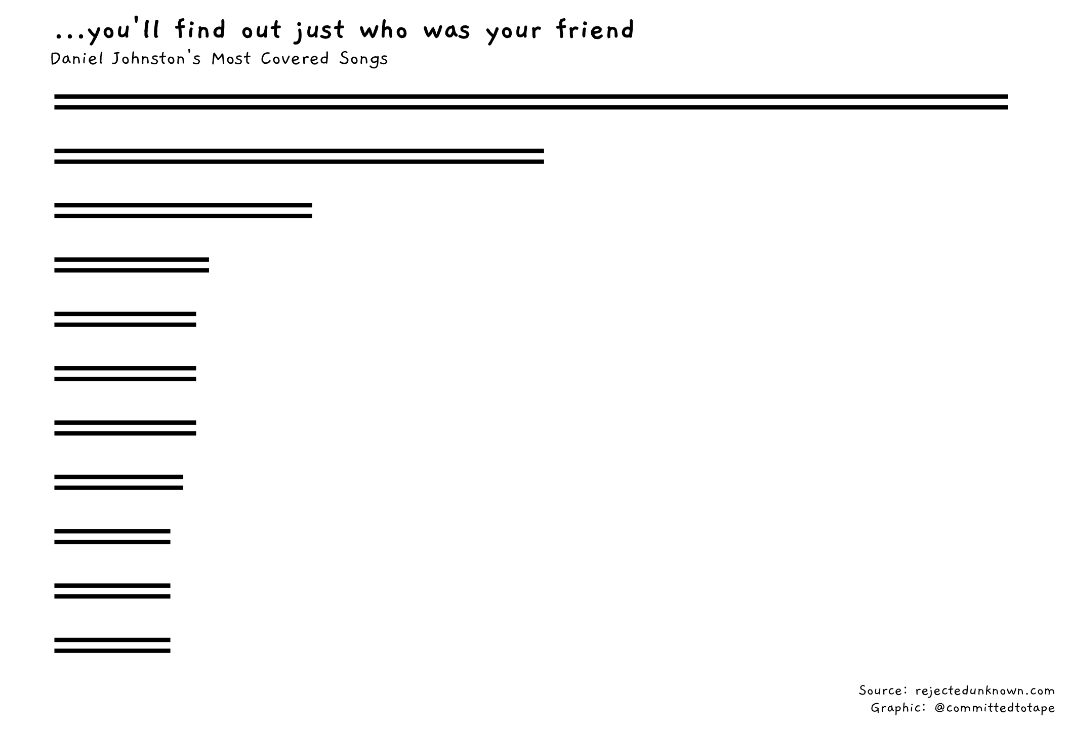
Next, let’s add the eyes! I’ll do this with the help of my favourite shape number: 21. This allows you to control both the colour of the body and outline of the point, with fill and colour respectively. And stroke enables you to adjust the thickness of the outline.
p1 <- p +
    geom_point(shape = 21, size = 8, fill = "white", colour = "black", stroke = 2) +
    geom_point(size = 2, colour = "black")

p1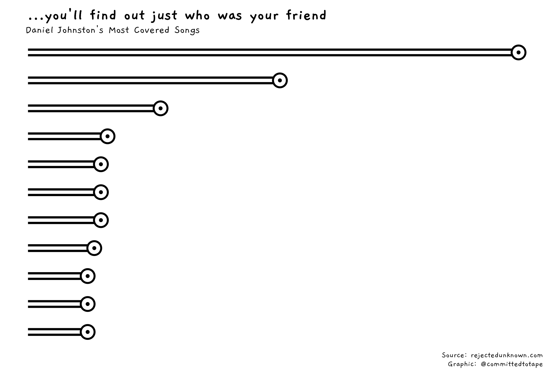
Now for some annotation, using geom_text. I’ll add the song names above the lines (inspired by Andy Kirk’s post), and a selection of cover artist names below the lines, using the nudge_x argument. I’ll also add a label for the number of times each song has been covered:
p2 <- p1 +
    geom_text(aes(y = 0, label = song), hjust = 0, nudge_x = 0.4, fontface = "bold", family = "Gaegu") +
    geom_text(aes(label = label_times, y = n + 3), fontface = "bold", size = 5, family = "Gaegu") +
    geom_text(data = artists_pick,
            aes(x = position, label = artists, y = n - 2), hjust = 1, nudge_x = -0.3,
            size = 3.5, family = "Gaegu")

p2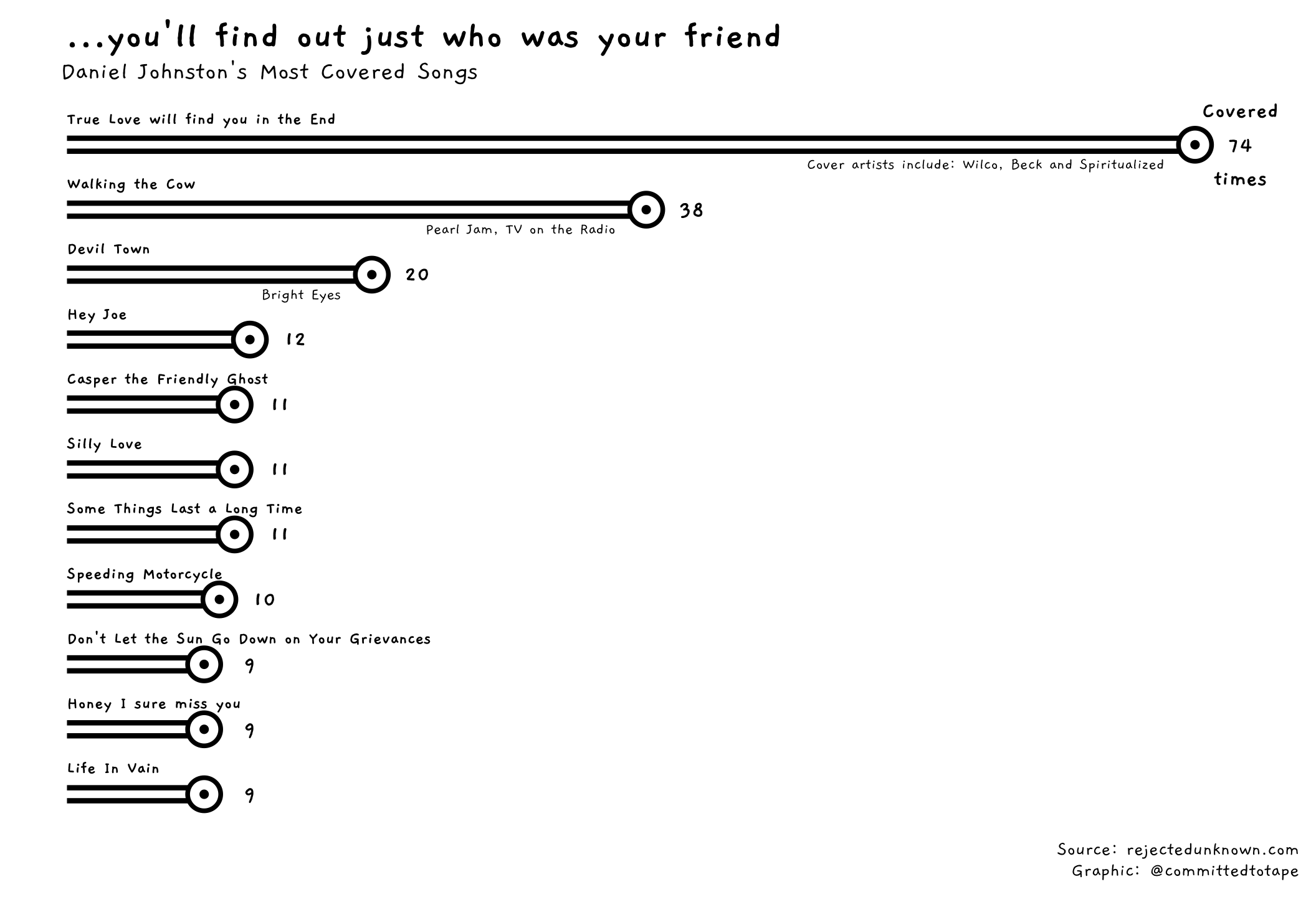
The finishing touches now. I’m adding an axis line on the left of the plot, and giving it a hand-drawn feel with position_jitter. Finally, I’m adding Jeremiah to fill the white space in the plot. This is done using geom_richtext from Claus Wilke’s ggtext package, which allows me to size the image and place it on the plot using x and y coordinates. Setting colour = NA ensures no outline around the image. I add the overall song counts above Jeremiah’s eyes with some annotate calls:
p3 <- p2 +
  geom_line(aes(y=-0.5), position = position_jitter(h = 0.1), colour="black", size = 2) +
  geom_richtext(aes(label = "<img src='data/hi-how-are-you.png'
    width='300'  />", x = 8.5, y = 60), colour = NA) +
  annotate("text", label = glue("{overall$songs} songs covered"),
           x = 5, y = 52, fontface = "bold", size = 5, family = "Gaegu") +
  annotate("text", label = glue("{overall$covers} times"),
           x = 5, y = 65, fontface = "bold", size = 5, family = "Gaegu")

p3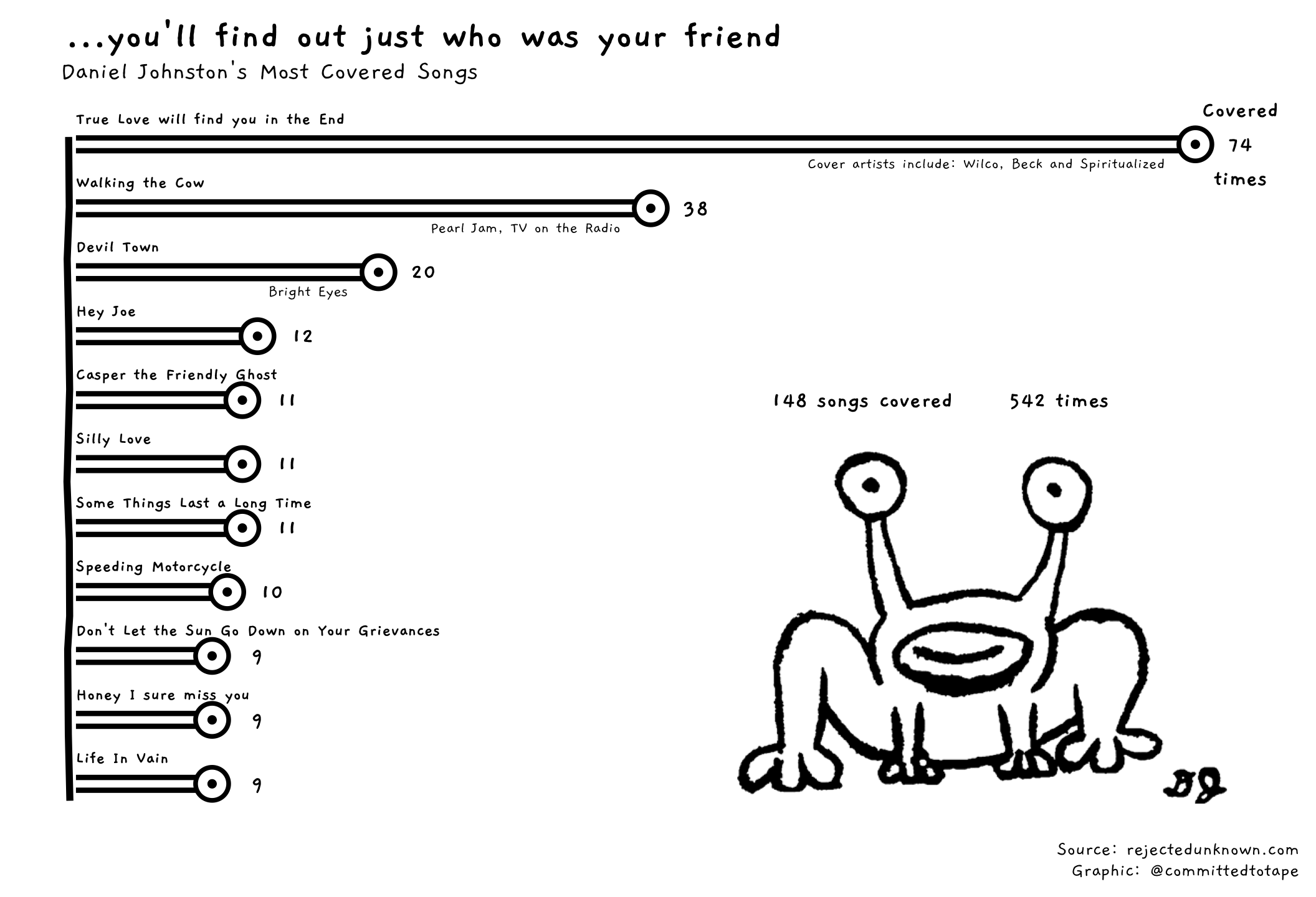
End
“I’ve come this far and I know I can make it…” Silly Love
There it is. A brief tour of the music of Daniel Johnston and how a simple bar chart can be turned into something more engaging. In total, I worked on this project for about 4 hours. It would have been a quicker exercise but for a couple of sticking points:
- I had never added an image into a plot before, so had to work out how to do that. I ultimately ended up using the
ggtextpackage after a few false starts with other packages. Althoughggtexthas been primarily built for customising text annotations in plots, it also has a straighfoward implementation for adding images, alllowing the position and size of the image to be specified.
- I wanted to give the whole plot a hand-drawn feel, but couldn’t find a way in the time I had to make the
geom_linerangelines wonky. I ended up compromising and just adding a wonky axis line usinggeom_line. I think I could’ve achieved the overall hand-drawn effect given more time.
No surprises that ‘True Love will find you in the end’ tops the list of most covered songs. A beautiful, enduring and raw pop song. I could never tire of it. Thanks for the music Dan!
And thanks for reading!