Happy Days
“Donny’s reading it and he kinda looks down, then says ‘what do you think of the script?’ and I shrugged and replied ‘people like the show, it’s hard to argue with being number one’ and he looked up and said, ‘he’s jumping a shark now?’.” Ron Howard, talking to Marc Maron in 2016
In season 5, episode 3 of the hit TV show Happy Days, Arthur “The Fonz” Fonzarelli dons swimming trunks and water skis (whilst retaining leather jacket) and jumps over a shark. History has not been kind to this particular TV moment. The phrase ‘jumping the shark’ has since been adopted to describe not only the moment that ‘Happy Days’ strayed away from its original premise in pursuit of more entertaining and outlandish storylines, but also when any show follows a similar fate.
But did Happy Days really ‘jump the shark’ at the moment The Fonz literally jumped the shark? Did this particular episode really signal the beginning of the end, with the show falling into terminal decline thereafter? Why did The Fonz not remove his leather jacket?
To attempt to answer at least 2 of these 3 questions, I will use the (rather simplistic) method of tracking the show’s IMDb ratings throughout its 11 season lifetime, plotting it using ggplot2 with plenty of customisation. If you’re that way inclined, you can skip straight to The Plot.
Before we get going, a big thanks to Data Critics for the inspiration on this one. Check out their charting of The Simpsons, which gave me the motivation to visualise this small corner of TV history.
Getting started
Let’s load the required packages:
library(tidyverse)
library(glue)
I’ll be using the tidyverse package like always. I’ll also be trying out the glue package for the first time, to help with sticking strings together.
The Data
I have scraped the data from IMDb using the rvest package, with help from purrr to cycle through my scrape function for the 11 season URLs. However, I’m going to save this sort of thing for another blog post where I can devote more time to it. I want to spend most of this blog post focussing on the final ggplot2 data visualisation. Here is the scrape code if you want to glance over it:
library(rvest)
library(lubridate)

# create vector of urls for each of the 11 seasons of the show
urls <- paste0("https://www.imdb.com/title/tt0070992/episodes?season=", 1:11)

# create function to scrape the data, the urls will then be passed through this function
imdb_scrape <- function(url) {

# pause between each page scrape
Sys.sleep(3)

readurl <- read_html(url)

# name of episode
name <- readurl %>%
  html_nodes("#episodes_content strong a") %>%
  html_text()
name

# rating of episode
rating <- readurl %>%
  html_nodes(".ipl-rating-widget >.ipl-rating-star .ipl-rating-star__rating") %>%
  html_text()
rating

# season and episode number of episode
s_ep <- readurl %>%
  html_nodes(".zero-z-index div") %>%
  html_text()
s_ep

# date the episode was aired
air_date <- readurl %>%
  html_nodes(".airdate") %>%
  html_text() %>%
  str_remove("\n") %>%
  str_trim()
air_date

# combine the above vectors into a tibble
# format rating as a numeric and air date as a date
series <- tibble(ep_name = name, ep_rating = as.numeric(rating), season_episode = s_ep,
                   date_aired = dmy(air_date))

}

# loop the 11 urls through the scrape function
# map_df will then bind each of the 11 final dataframes together into 1 dataframe
happy_days <- map_df(urls, imdb_scrape)
And here is a look at the data scraped:
head(happy_days)## # A tibble: 6 x 4
## ep_name ep_rating season_episode date_aired
## <chr> <dbl> <chr> <date>
## 1 All the Way 7.7 S1, Ep1 1974-01-15
## 2 The Lemon 7.6 S1, Ep2 1974-01-22
## 3 Richie's Cup Runneth Over 7.9 S1, Ep3 1974-01-29
## 4 Guess Who's Coming to Visit 7.8 S1, Ep4 1974-02-05
## 5 Hardware Jungle 7.6 S1, Ep5 1974-02-12
## 6 The Deadly Dares 7.6 S1, Ep6 1974-02-19I’ve extracted 4 variables, the episode name, the IMDb rating for that episode, the season/episode number and the date the episode was broadcast. I’m going to do a little cleaning of this data before getting to the plot:
happy_days <- happy_days %>%
  separate(season_episode, c("season", "episode"), sep = ", ") %>%
  mutate_at(c("season", "episode"), parse_number) %>%
  mutate(series_episode = row_number())

head(happy_days)
## # A tibble: 6 x 6
## ep_name ep_rating season episode date_aired series_episode
## <chr> <dbl> <dbl> <dbl> <date> <int>
## 1 All the Way 7.7 1 1 1974-01-15 1
## 2 The Lemon 7.6 1 2 1974-01-22 2
## 3 Richie's Cup Runneth… 7.9 1 3 1974-01-29 3
## 4 Guess Who's Coming t… 7.8 1 4 1974-02-05 4
## 5 Hardware Jungle 7.6 1 5 1974-02-12 5
## 6 The Deadly Dares 7.6 1 6 1974-02-19 6I’m splitting out the season and episode numbers using the separate function and using the very handy parse_number function to extract the number from a character string and convert to numeric. I’m also creating an overall series episode number using row_number.
Data preparation for plot
There are a few more steps I’ll take to create supplementary data for the plot. Along with plotting the ratings for every episode, I’m also going to chart the average for each season. I’ll use the newly created series_episode along the x-axis, to plot every episode rating, but I actually want the x-axis to be annotated with the Season number, with vertical lines showing where each season starts and ends. That is why I’m also calculating the min, max and mid-point of each season. Hopefully all will become clear when I get to the plot.
happy_days_season <- happy_days %>%
  group_by(season) %>%
  summarise(season_avg = mean(ep_rating),
            min = min(series_episode),
            max = max(series_episode),
            mid = min + (max - min) / 2,
            season_break = max + 0.5
            ) %>%
  ungroup() %>%
  mutate(label = case_when(row_number() == 1 ~ paste0("Season\n", season),
                           TRUE ~ as.character(season)),
         y = 5.2)

happy_days_season
## # A tibble: 11 x 8
## season season_avg min max mid season_break label y
## <dbl> <dbl> <dbl> <dbl> <dbl> <dbl> <chr> <dbl>
## 1 1 7.71 1 16 8.5 16.5 "Season\n1" 5.2
## 2 2 7.86 17 39 28 39.5 2 5.2
## 3 3 7.73 40 63 51.5 63.5 3 5.2
## 4 4 7.54 64 88 76 88.5 4 5.2
## 5 5 7.16 89 115 102 116. 5 5.2
## 6 6 7.15 116 142 129 142. 6 5.2
## 7 7 6.95 143 167 155 168. 7 5.2
## 8 8 6.50 168 189 178. 190. 8 5.2
## 9 9 6.75 190 211 200. 212. 9 5.2
## 10 10 6.77 212 233 222. 234. 10 5.2
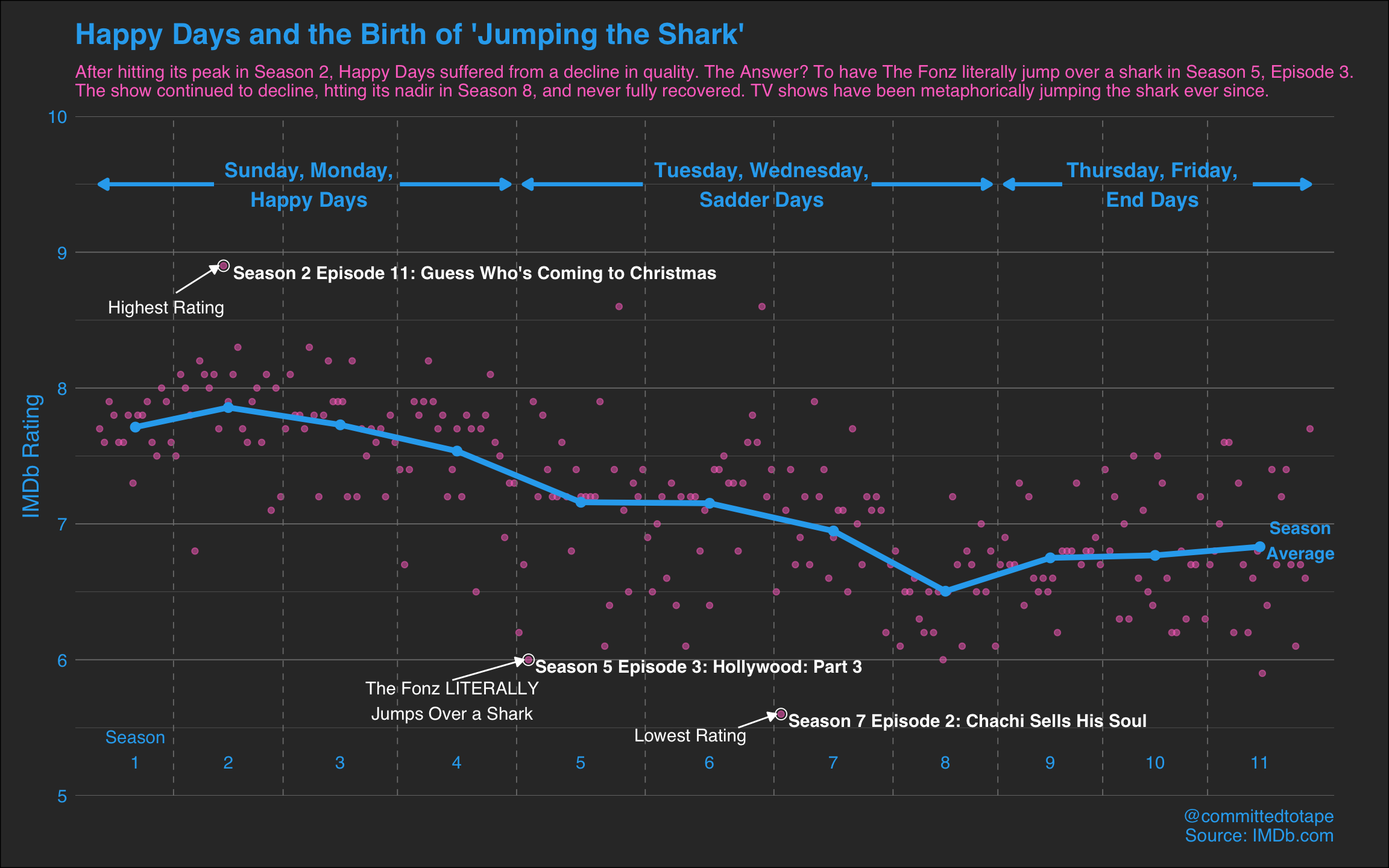
## 11 11 6.83 234 255 244. 256. 11 5.2I’m creating a small dataframe of 3 episodes I’ve selected to be annotated in final plot. These are the series’ highest and lowest rated episodes, along with the now infamous ‘jump the shark’ episode (episode 91). I’m using glue to create character strings to be added to the plot:
selected_eps <- happy_days %>%
  filter(ep_rating %in% c(min(ep_rating), max(ep_rating)) | series_episode == 91) %>%
  mutate(label = glue("Season {season} Episode {episode}: {ep_name}"))
The Plot
Now we are ready to plot! There’s a fair bit to this ggplot so I’ll go through some of it above the code, and then some more after.
- I’ll start just by adding a layer of points for the rating of each episode using
geom_point. - Next I’ll add the vertical lines I mentioned earlier to split the plot into seasons (using
geom_vline), along with the label for each season (usinggeom_text).
- The following
geom_lineandgeom_pointthen add the season averages (as points connected by a line). - I then add yet another
geom_pointlayer to highlight the 3 episodes I selected earlier by circling in white (usingshape = 1), along with a label for the names of the episodes.
- There are then several annotation layers:
- The first
annotateadds the commentary for the 3 selected episodes already highlighted. - The second
annotateadds the arrows that link this commentary to the relevant point. - The 3rd and 4th
annotateadd the blue annotation along the top with the arrows. - Finally, the 5th
annotateis to indicate that the blue line is the Season Average.
- The first
ggplot(happy_days, aes(x = series_episode, y = ep_rating)) +
  geom_point(colour = "#FF76C9", alpha = 0.5) +
  geom_vline(xintercept = happy_days_season$season_break[-11],
             linetype = 2, colour = "gray50", size = 0.3) +
  geom_text(data = happy_days_season, aes(x = mid, y = y, label = label),
            vjust = 0, colour = "#2BACEF", family = "Helvetica") +
  geom_line(data = happy_days_season, aes(x = mid, y = season_avg),
            colour = "#2BACEF", size = 1.7) +
  geom_point(data = happy_days_season, aes(x = mid, y = season_avg),
             colour = "#2BACEF", size = 2.5) +
  geom_point(size = 3, shape = 1, colour = "white", data = selected_eps) +
  geom_text(aes(label = label), data = selected_eps, hjust = -0.02, vjust = 1,
            colour = "white", fontface = "bold", family = "Helvetica") +
  annotate("text", x = c(15, 75, 125), y = c(8.6, 5.7, 5.45), colour = "white", family = "Helvetica",
           label = c("Highest Rating",
                     "The Fonz LITERALLY\nJumps Over a Shark",
                     "Lowest Rating")) +
  annotate("segment",
           x = c(17, 75, 135), xend = c(26, 90, 143),
           y = c(8.7, 5.85, 5.5), yend = c(8.9, 6, 5.6),
           colour = "white",
           arrow = arrow(type = "closed", length = unit(0.2,"cm"))) +
  annotate("text", x = c(45, 140, 222), y = 9.5,
           colour = "#2BACEF", fontface = "bold", size = 4.5, family = "Helvetica",
           label = c("Sunday, Monday,\nHappy Days",
                     "Tuesday, Wednesday,\nSadder Days",
                     "Thursday, Friday,\nEnd Days")) +
  annotate("segment",
           x = c(25, 64, 115, 163, 203, 243), xend = c(1, 87, 90, 188, 191, 255),
           y = 9.5, yend = 9.5,
           colour = "#2BACEF", size = 1.2,
           arrow = arrow(type = "closed", length = unit(0.2,"cm"))) +
  annotate("text", x = 253, y = 6.88, label = "Season\nAverage",
           colour = "#2BACEF", fontface = "bold", size = 3.8, family = "Helvetica") +
  scale_x_continuous(expand = c(0.02, 0.02)) +
  scale_y_continuous(limits = c(5, 10), expand = c(0,0)) +
  labs(x = NULL, y = "IMDb Rating",
       title = "Happy Days and the Birth of 'Jumping the Shark'",
       subtitle = "After hitting its peak in Season 2, Happy Days suffered from a decline in quality. The Answer? To have The Fonz literally jump over a shark in Season 5, Episode 3.\nThe show continued to decline, htting its nadir in Season 8, and never fully recovered. TV shows have been metaphorically jumping the shark ever since.",
       caption = "@committedtotape\nSource: IMDb.com") +
  theme_minimal() +
  theme(text = element_text(colour = "#2BACEF", size = 14, family = "Helvetica"),
        plot.background = element_rect(fill = "gray20"),
        plot.title = element_text(size = 18, face = "bold"),
        plot.subtitle = element_text(colour = "#FF76C9", size = 11,
                                     margin = margin(5, 0, 10, 0)),
        panel.grid.minor.x = element_blank(),
        panel.grid.major.x = element_blank(),
        panel.grid.major.y = element_line(colour = "gray50", size = 0.3),
        panel.grid.minor.y = element_line(colour = "gray50", size = 0.1),
        axis.text.y = element_text(colour = "#2BACEF"),
        axis.text.x = element_blank(),
        plot.margin = margin(0.5, 1.2, 0.5, 0.5, "cm")
  )
I’ve set the y-axis limits to 5 and 10, which was a conscious decision. The setting of limits can be a topic of heated debate. You could argue that as a rating could range from 0 to 10, then the y-axis should start at 0. This would of course make the changes in rating over time look far less severe. However, in reality how many shows drop below a 5 rating (without getting swiftly canned by a trigger happy TV exec)? As the lowest rating in my data is 5.6, I’ve decided to set the lower limit at 5. Although it never quite made it above a 9 rating, I’ve still set the upper limit to 10. From a design perspective this seems to frame the data nicely, giving space for the annotations to be added at the top and bottom. Feel free to disagree with this decision!
Notice I’ve removed the x-axis grid lines and text as I’ve created my own x-axis annotations and lines already. I’m also customising the y-axis grid lines and changing the margins around the plot.
All this contrives to produce:
Conclusion
So, getting back to The Fonz and his leather-jacket-and-water-skis combo.
It’s clear from this plot that the ‘jump the shark’ episode was the lowest rated episode in the series up to that point (scoring a 6). And it appears that the series was already on the downhill slope by that point, having seemingly peaked way back in Season 2. Despite the odd highlight later in Season 5 and 6, it never recaptured its early form and continued to decline, hitting its nadir in Seasons 7 and 8. However, there was a small recovery through Season 9 to the show’s finale in Season 11. Perhaps they should’ve kept going? What else could The Fonz have jumped over?
Limitations/Further Analysis
Just going by IMDb ratings does not provide the most rigorous of approaches. It would be interesting to capture more ratings to get a richer view on how it was received critically. It would also be great to include audience viewing figures. Although the critics may have disapproved, perhaps it was still a hit commercially?
The obvious extension of this analysis would be to look at other hit TV shows to see if they also have ‘jump the shark’ moments. Is there a common trend with shows peaking faily early on in their lifetime, before entering a period of protracted decline. Are there any shows that have actually improved over time and gone out on a high? These are all questions for another day.
Thanks for reading, and watch out for those sharks!